Case Study · 2022–2024
← Back to WorkLifecycle & Email Campaigns
Designing the full email lifecycle from welcome sequences to re-engagement campaigns. Building scalable templates in Braze and establishing a visual language that drove measurable retention.
Role
Sole Designer · lifecycle, brand & product
Team
CRM manager, lifecycle marketer, data analyst, front-end developer
Timeline
2022–2024 · ongoing
Tools
Figma, Braze, HTML email
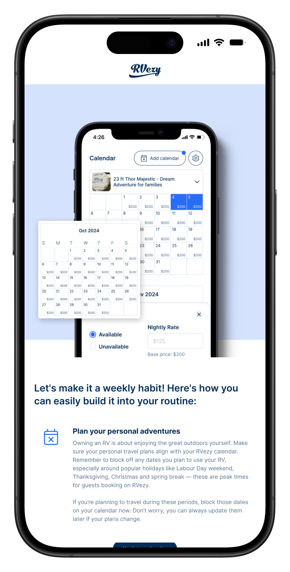
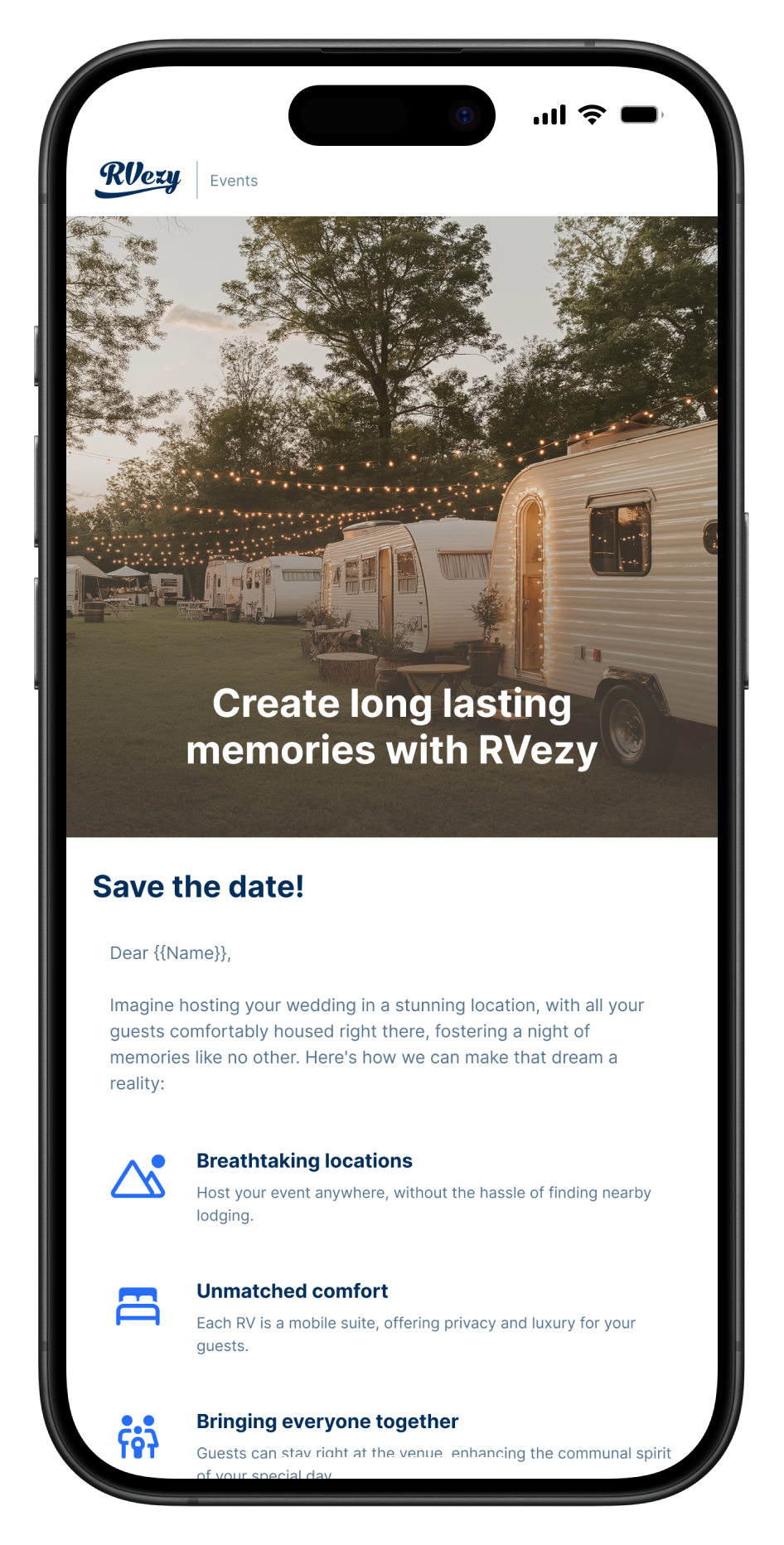
Over two years, I designed every customer-facing email. Transactional confirmations, marketing campaigns, seasonal promotions, host communications, re-engagement sequences, and referral flows. This wasn't a one-off project; it was an ongoing system that grew with the business.
Once everything was deisgned in Figma we built a modular email template system in Braze. Instead of designing each email from scratch, we created composable blocks, hero modules, listing cards, CTA patterns, testimonial strips. These could be assembled into new campaigns in hours instead of days with minimum design oversight.
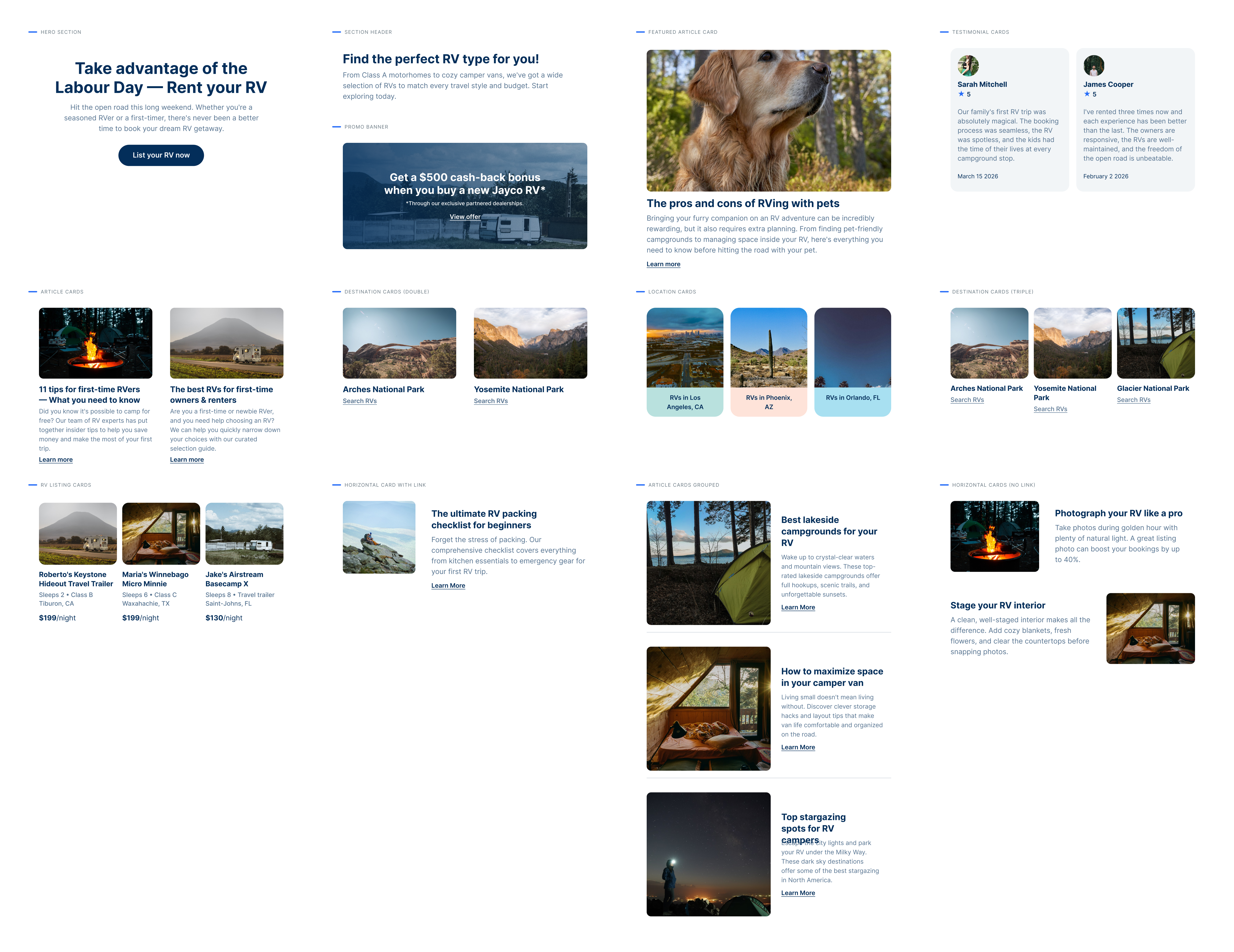
I mapped every touchpoint in the guest and host journeys where email played a role. The guest lifecycle alone had 23 distinct email touchpoints. The host side had another 18.
We identified the highest-leverage moments: the 48 hours after a search without booking (re-engagement), the day before a trip (anxiety reduction), and the first week after a host's listing goes live (activation coaching).
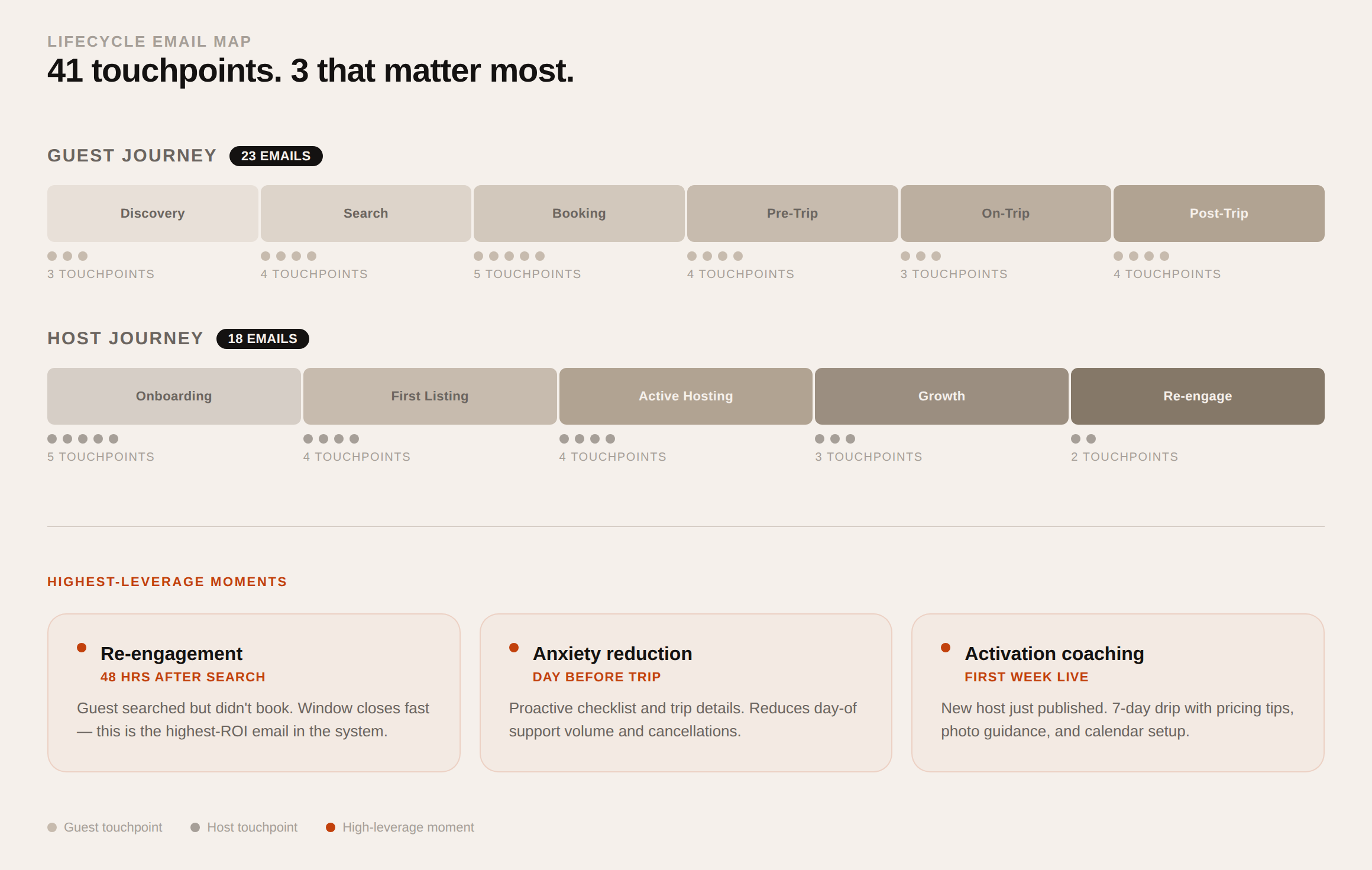
Modular blocks
Every email is built from a library of 12 reusable blocks. Hero images, listing grids, single-CTA sections, testimonials, pricing callouts, and more. Each block is tested across 30+ email clients and has dark mode variants.
Brand consistency at scale
Before the system, each campaign was a one-off design. After, anyone on the marketing team could build a new email while maintaining visual consistency without design bottlenecks. This freed me up for higher-leverage product work.
Designing for the inbox, not the browser
Email is one of the most hostile design surfaces there is. Layouts are built with tables, many clients block images by default, some versions of Outlook render with a word-processor engine, and dark mode can invert your colors without asking. A polished Figma comp means nothing if half the audience sees a broken version of it.
So the system was designed around those constraints from day one: single-column layouts that degrade gracefully, live text instead of text baked into images, alt text written as real copy, and colors chosen to survive automatic dark-mode inversion. Every block was tested across clients before it was allowed into the library.
Three moments that mattered most
- After a search without a booking. Within 48 hours, guests received the RVs they had viewed, with live availability and pricing pulled in, plus similar options nearby. The goal was to feel like a helpful reminder, not a chase.
- The day before a trip. First-time renters are anxious. This email gathered pickup details, a pre-trip checklist and the host’s contact into one place, cutting last-minute support calls and setting up a good first trip.
- A host’s first week. New listings that don’t get booked early tend to go quiet. A short coaching sequence nudged hosts to add photos, adjust pricing and enable instant book, the same actions the product later surfaced in the Host Dashboard.
Measuring what actually mattered
Early on, success was judged by open rate. That metric became unreliable as mail privacy features started inflating opens, so I worked with our data analyst to move the team toward clicks, bookings and GMV attributed to each campaign. Key flows ran with holdout groups, which is how we could credibly attribute the $1.2M in incremental GMV rather than counting revenue that would have happened anyway.
That shift changed the creative work too. Instead of debating subject lines in isolation, we tested whole structures (one call to action versus several, listing-led versus story-led) and let the results shape the next round of templates.
Working with CRM, data and engineering
Design was only one part of each campaign. I worked with our CRM manager on segmentation and trigger logic in Braze, so the right email reached the right person at the right moment, and with a front-end developer who turned the Figma blocks into robust, tested HTML.
Compliance shaped the work too. Canadian anti-spam rules set clear expectations around consent, sender identification and unsubscribing, so those elements were designed into every template rather than added at the end.
Our data analyst set up the reporting that tied campaigns to bookings, and we reviewed results together after each major send. Those reviews decided which blocks stayed in the library, which were redesigned, and which quietly disappeared.
Designing myself out of the loop
The real deliverable wasn’t 50+ campaigns; it was a system the marketing team could run without me. I documented every block with usage notes, built starter templates for the most common campaign types, and reviewed the first campaigns the team built on their own. After that, design review became the exception rather than the rule, which is where the 4× faster production came from.
Results
Emails that earn.
+13%
Overall email engagement rate improvement
$ 1.2M
Incremental GMV attributed to lifecycle campaigns
4×
Faster campaign production with the template system
Time to produce a campaign