Case Study · 2022–2023
← Back to WorkHost Onboarding Overhaul
Rebuilding the host sign-up experience from landing page to first published listing. Reducing friction at every step and establishing the onboarding framework still in use today.
Role
Sole Product Designer
Team
PM, growth marketing, web & mobile engineers, data analyst
Timeline
10 months · 2022–2023
Platforms
Web, iOS & Android
The funnel was leaking at every step
Host acquisition was expensive. Paid campaigns drove traffic to a host landing page, but conversion from visitor to published listing was dismal. Funnel analysis revealed the bleed:
100%
Landing page
34%
Started sign-up
18%
Reached listing
9%
Published listing
91% of people who landed on the host page never published a listing. The biggest drops happened at the initial value proposition and the listing creation form, which had too many required fields, confusing photo requirements, and unclear pricing guidance.
Step 1
Reframe the landing page
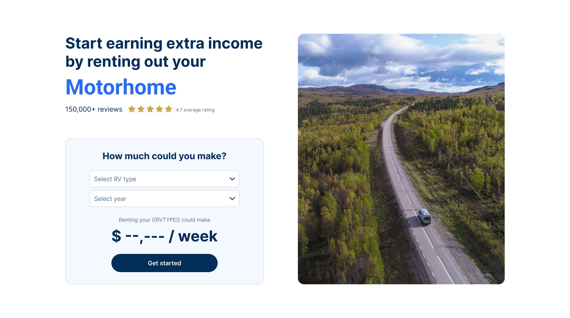
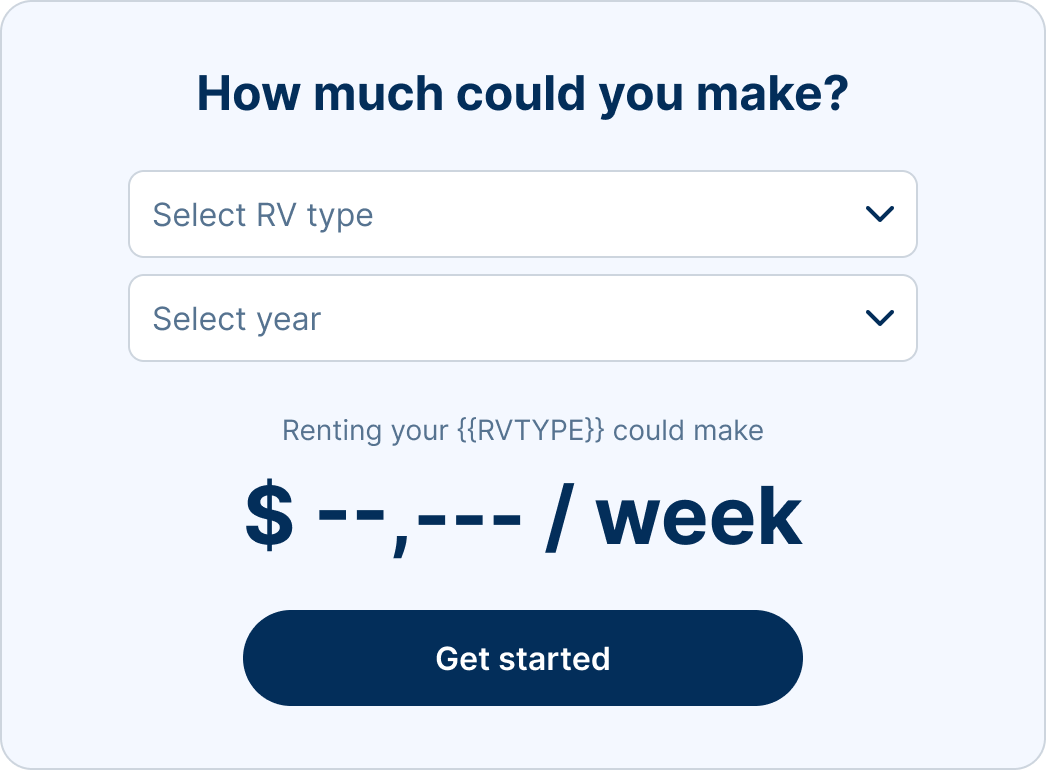
Replaced the generic "List your RV" page with a calculator-led experience. Visitors enter their RV type and location to see projected earnings before creating an account. This shifted the framing from "do work" to "see what you could earn." Landing page to sign-up conversion jumped from 34% to 52%.
Step 2
Progressive listing creation
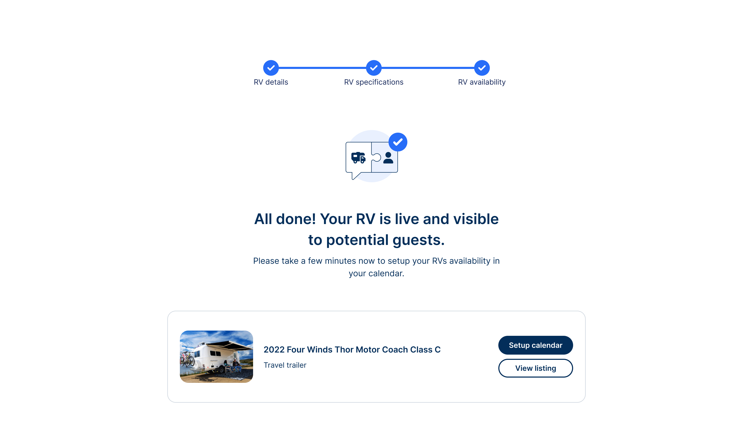
The old form asked for everything at once: 28 fields on one page. I redesigned it as a guided, step-by-step flow. Each screen asks for one category of information, with smart defaults and inline help. Required fields dropped from 28 to 12 for the minimum viable listing.
Finding the leaks before fixing them
Before touching a screen, I partnered with our data analyst to instrument the full path from landing page to first published listing. Sign-up was tracked, but almost nothing after it was, so we added step-level events to the listing flow and built a funnel dashboard the whole team could watch. That dashboard became the scoreboard for the next ten months.
Alongside the numbers, I interviewed hosts who had started a listing and abandoned it, plus a handful who had recently published, and watched session recordings of the listing form. The pattern was consistent: people weren’t put off by the idea of renting out their RV. They were overwhelmed by being asked for everything, immediately, before they knew whether it was worth their time.
We shipped in phases rather than as one big relaunch. Each step went out behind a feature flag and was A/B tested against the old experience, so we always knew which change moved which part of the funnel.
Pricing and photos: the two hardest questions
- Smart pricing guidance. New hosts had no idea what to charge. The flow now suggests a nightly rate based on comparable RVs nearby and the season, with a one-tap “use suggested price” option and a plain explanation of how it was calculated. Hosts who accepted the suggestion booked far sooner, which is where the 2.3× first-month booking rate comes from.
- Photo guidance. Photos were the most common reason listings stalled. I replaced a blank upload box with a short checklist of must-have shots (exterior, interior, sleeping area, driving cab), example images, and direct upload from the phone, so hosts could finish the listing standing next to their RV.
- Save and resume. Every step saves automatically. Hosts can leave mid-flow and pick up where they left off on any device, with a reminder email if they don’t come back.
Fewer fields, without lowering the bar
The biggest pushback came from operations and trust & safety. Cutting required fields from 28 to 12 sounded like a recipe for low-quality listings. We worked through it field by field: anything needed to evaluate or book an RV stayed; anything that could be completed later moved after publishing. Insurance details and verification became requirements before a host’s first booking, not before their first listing.
That reframing, a minimum viable listing first and a complete listing over time, only worked because we paired it with persistent reminders to finish the rest. Those reminders later grew into the onboarding cards in the Host Dashboard redesign.
The other challenge was attribution. Paid campaigns, seasonality and the redesign were all moving at once. Running each phase as an experiment with a control group let us separate the effect of the design from a good month of marketing.
One funnel, many owners
Onboarding cut across almost every team. Growth marketing owned the ads that brought hosts in, so we aligned campaign messaging with the new earnings-led landing page; promising one thing in an ad and showing another on arrival was part of the original leak.
Engineers on web and mobile built the calculator and the step-by-step flow, and we kept the two platforms in lockstep so a host could start on a laptop and finish on a phone. Our data analyst and I reviewed the funnel together every week, which kept the team focused on the biggest drop-off rather than the most interesting idea.
Operations joined those reviews as well. They heard directly from new hosts, and their notes on what people were confused about often told us why a step was underperforming before the numbers could.
What I’d do next
The framework from this project is still the backbone of host onboarding today. If I revisited it, I’d personalize the flow by RV type, since a towable trailer and a Class A motorhome have very different requirements, and bring the earnings calculator into retargeting emails so the “see what you could earn” moment follows people who leave.
Results
After the redesign.
+27%
Increase in visitor-to-published-listing activation rate
$ 3.4M
Annualized GMV from incremental new host listings
2.3×
First-month booking rate for hosts who used smart pricing
Landing page to sign-up conversion