Case Study · 2024
← Back to WorkHost Dashboard Redesign
Replacing a static host landing screen with an action-driven notification centre — surfacing what hosts need to do right now, how they're performing against targets, and what's coming next.
Context
Our existing host home screen was a dead end. It showed a booking count and an earnings total, but gave hosts no indication of what they should do next. Booking requests went unaccepted. Enquiries sat unanswered. New hosts stalled mid-onboarding because nothing prompted them to finish.
The business needed hosts to act — accept bookings faster, respond to guests, complete verification, enable instant book. The existing screen wasn't driving any of that. We needed a notification centre, not a summary page.
Hosts didn't know what to do next
New hosts who hadn't completed ID verification, insurance profiles, or payout setup had no persistent reminder. Booking requests and enquiries lived in separate screens with no urgency signals. The dashboard didn't tell hosts what needed attention — it just showed them what already happened.
No visibility into performance targets
We have clear benchmarks for host quality: 70% acceptance rate, 90% response rate, maximum 1 cancellation per year. Hosts had no idea these targets existed, let alone where they stood against them. Underperforming hosts didn't know they were underperforming.
The old host home screen — static numbers, no actions, no targets
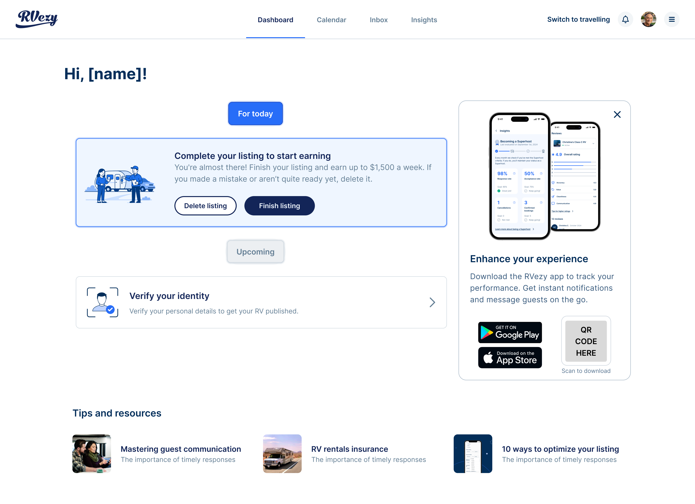
I modeled the new dashboard after Airbnb's host home — a feed of contextual notification cards that surface the right action at the right time — but tailored it for the unique elements of RV rentals: inspection windows, onboarding calls, seasonal availability, and multi-day trips.
Booking action cards
Pending booking requests and unanswered enquiries surface as top-priority cards with clear accept/decline actions. No more navigating to a separate bookings screen to find out something needs attention.
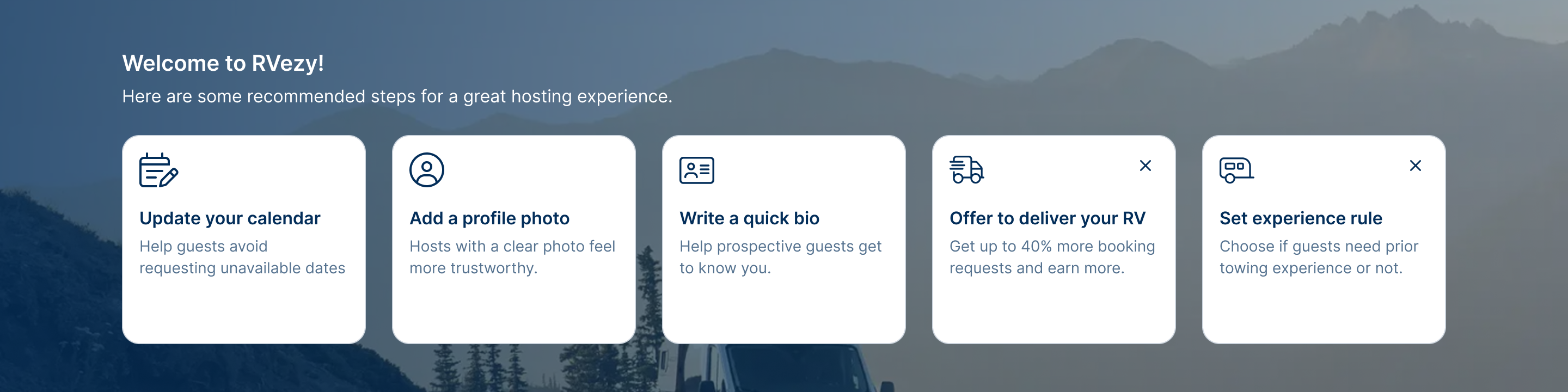
Onboarding nudges
Hosts who haven't completed required steps — ID verification, insurance profile, payout setup — see persistent cards with one-tap actions. A dedicated card lets new hosts book an onboarding call directly via Calendly.
Inspection reminders
On trip start and return dates, hosts see notification cards prompting them to complete departure and return inspections. Cards appear and disappear based on each booking's check-in/check-out times, with deep links into the app's inspection flow.
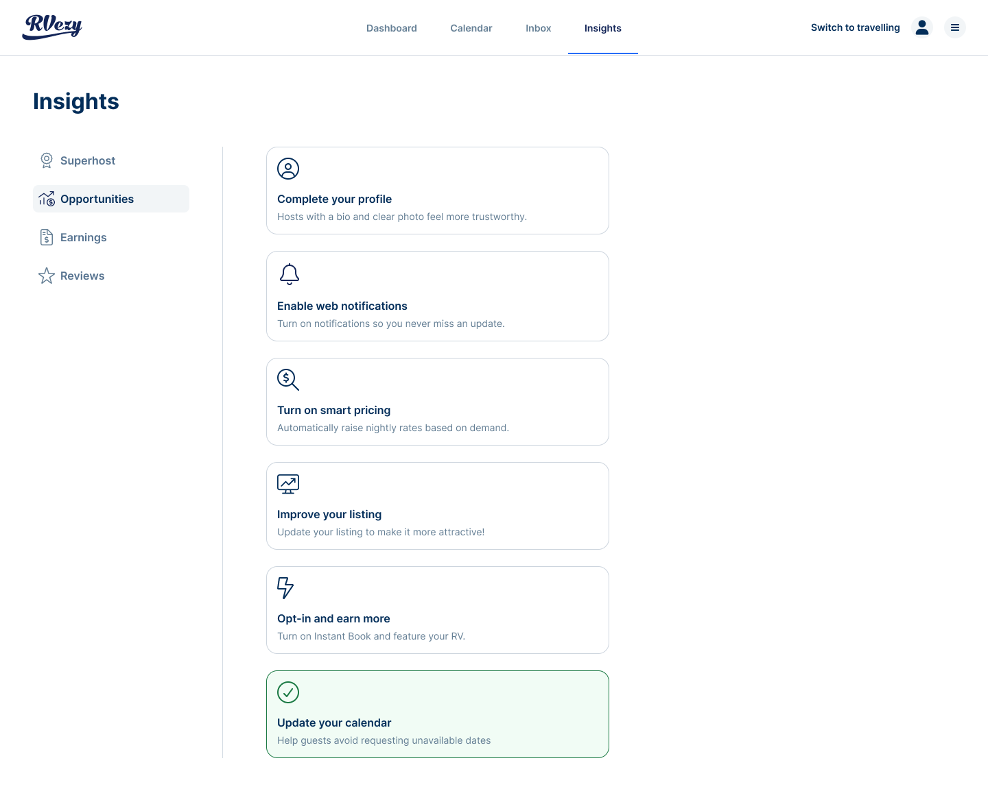
Opportunity cards
Contextual nudges for growth actions — enabling instant book where eligible, improving listing photos, adjusting seasonal pricing. These appear based on host behavior and eligibility, not on a fixed schedule.
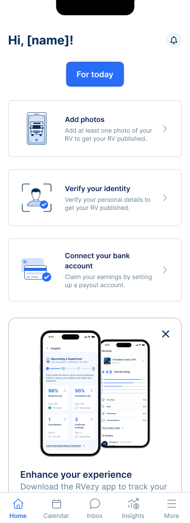
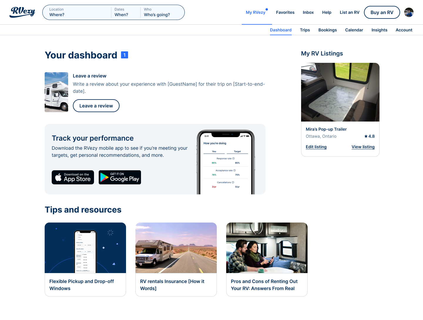
The dashboard needed to work for a brand-new host with a draft listing, a host who just published but has zero bookings, and a veteran host managing multiple RVs. I mapped three core states and designed each one to feel useful, not empty.
State 1
Draft listing
Dashboard shows onboarding checklist cards — finish your listing, verify your identity, set up payouts, book your onboarding call. Progress bar at top shows completion.
State 2
Published, no data
Performance benchmarks show targets with "not enough data yet" messaging. Opportunity cards suggest actions to get the first booking: enable instant book, improve photos, review pricing.
State 3
Published, with data
Full dashboard: booking actions at top, performance stats against targets (acceptance rate vs. 70%, response rate vs. 90%, cancellations vs. max 1/yr), upcoming trip cards with inspection reminders.
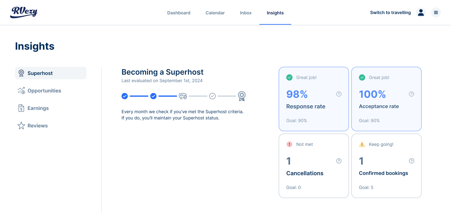
A key part of the redesign was making RVezy's host quality targets visible and persistent. Instead of burying these in a settings page, the dashboard shows them front and centre — always comparing current performance against the target.
70%
Acceptance rate target
Rolling 1-year window
90%
Response rate target
Replies within 24 hours
≤ 1
Cancellations per year
Maximum allowed
We launched the dashboard behind a 50/50 A/B test, split by user ID to ensure clean data. The experiment tracked separately on iOS and Android, triggered when a host landed on their dashboard. We measured acceptance rate, response rate, onboarding completion, and overall engagement.
Results
The numbers.
+22%
Increase in host dashboard engagement (weekly active hosts)
$1.5M
Incremental GMV attributed to faster booking acceptance
−31%
Reduction in "what do I do next?" support tickets
Reflection
The biggest shift was reframing the dashboard from "here's what happened" to "here's what you need to do." The notification card model — where cards appear, resolve, and disappear based on business logic — turned a passive screen into the primary driver of host behavior. The multi-state design was the hardest part: making the dashboard feel valuable whether a host has zero bookings or a hundred.